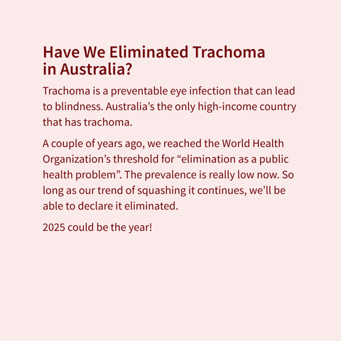
To help stamp out trachoma, you can donate to Fred Hollows Foundation to treat it directly or donate to a charity that helps communities emerge from poverty and break the cycle of infection and re-infection.
Recent searches
Search options
#30DayChartChallenge
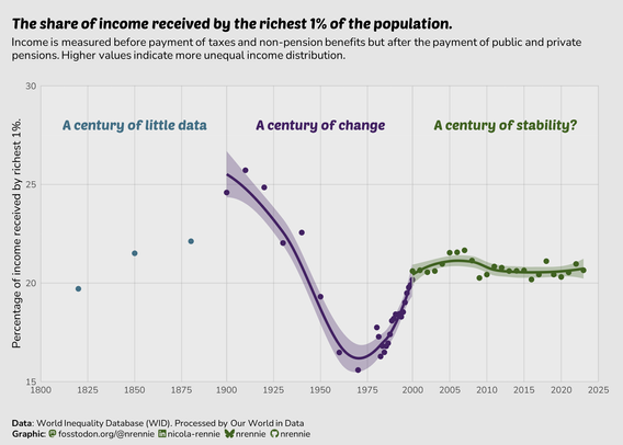
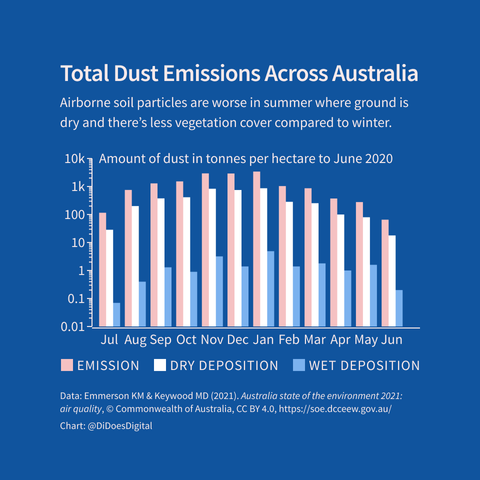
For Day 23 of the #30DayChartChallenge, the prompt is "Log scale"
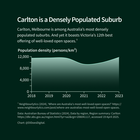
(Technically, this isn't actually a log scale but I wanted to play around with the idea of giving the more recent, more densely located data points more space)
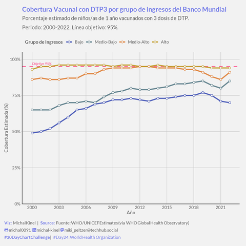
#30DayChartChallenge Día 24: ¡Usando datos de la @WHO! Hoy comparamos la cobertura de vacunación DTP3 (% niños 1 año) entre países agrupados por nivel de ingresos (Banco Mundial, 2000-2022). #TimeseriesWeek #SocialData #GlobalHealth
El gráfico muestra: ¡Gran mejora en todos los grupos hasta ~2019!
¡Pero una brecha enorme persiste! Los países de ingresos altos (amarillo
) cerca del objetivo 95% (línea rosa).
Los países de ingresos bajos (azul índigo
), aunque mejoraron mucho desde el 2000, se quedaron sobre el 70% y sufrieron un retroceso post-pandemia.
Un reflejo claro de la #EquidadEnSalud (o la falta de ella) a nivel global. ¡El acceso a vacunas básicas no es igual para todos!
#rstats #ggplot2 #data_table | Data: WHO GHO | Theme: #theme_week4_social
Código/Viz: https://t.ly/fRi1m
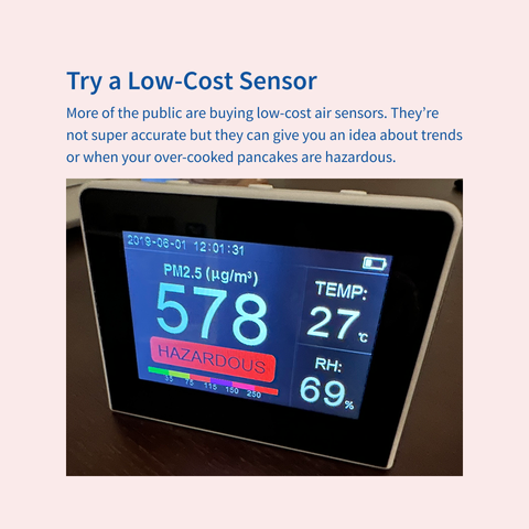
These days you can look up air quality for a bunch of places, but those numbers won't help you with your cooking.
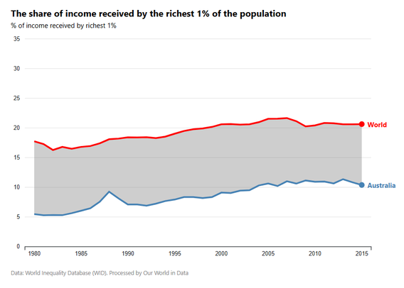
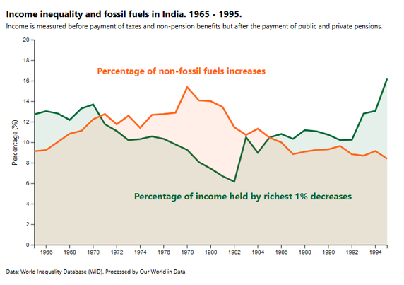
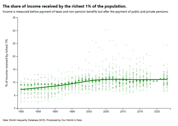
I'm almost back on track with the #30DayChartChallenge with another trio of plots - this time all made from scratch in D3!
I learned how to: Make scatter plots, line charts, and area charts
Highlight and annotate specific data points
Fit Loess curves in D3
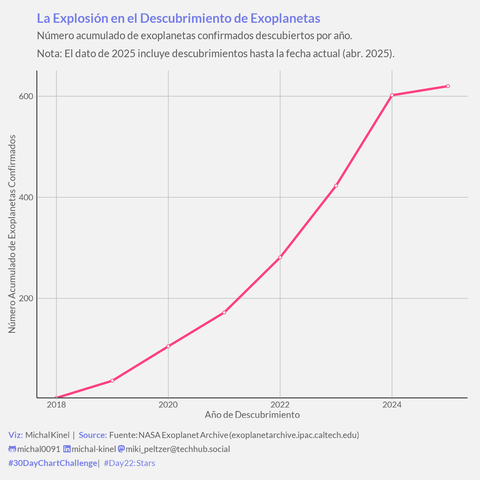
#30DayChartChallenge Día 22: Stars! Planetas, planetas por todas partes!
Gráfico del nº acumulado de exoplanetas confirmados (NASA Exoplanet Archive). #TimeseriesWeek #Astronomy
La curva muestra la explosión de descubrimientos desde los 90, ¡especialmente con Kepler & TESS! Ya superamos los miles de mundos conocidos.
*(Aclaración: El último punto de 2025 es el acumulado hasta hoy, 22 de Abril, no el año completo).*
Impresionante cómo avanza la ciencia que estudia los planetas de otras estrellas.
#rstats #ggplot2 | Data: NASA Exoplanet Archive | Theme: #theme_week4_social
Código: https://t.ly/bCzwJ
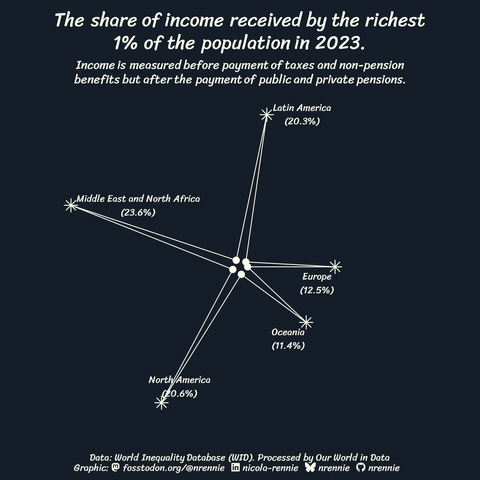
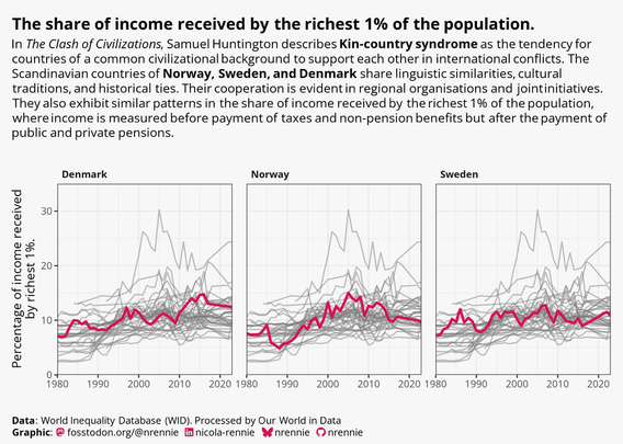
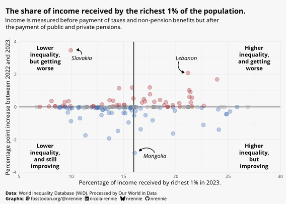
For Day 22 of the #30DayChartChallenge and the prompt of "Stars", I found it quite tricky to make the income inequality data I've been working with fit the prompt.
Is it a radar chart?
Is it a star?
Is it a constellation?
I don't know whether I love it or hate it , but either way it's made with #RStats! For reference, the inner 'stars' represent 1%.
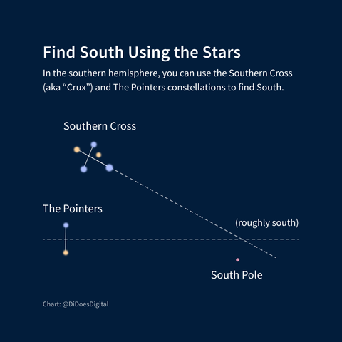
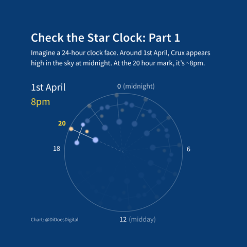
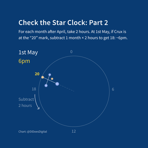
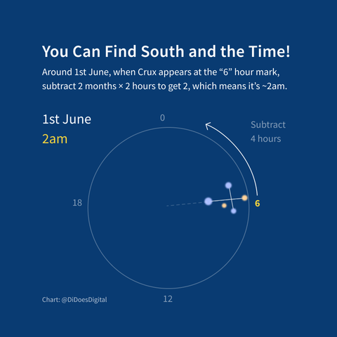
Down under, you can use the Southern Cross to tell time and direction.
Aboriginal Australians are among the world's first astronomers. The southern cross forms part of the Emu in the Sky, a dark constellation, which has featured in storytelling for thousands of years.
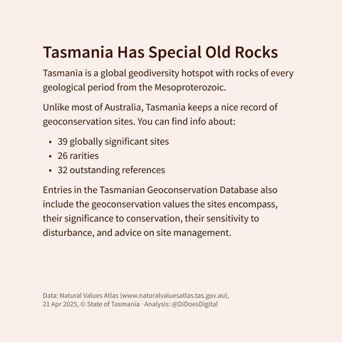
Are you also pleased to know that the Tassie geo database has 97 results for "fossiliferous"?
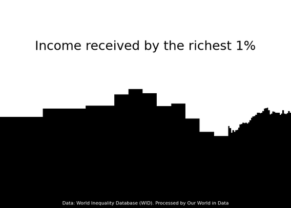
For Day 20 of the #30DayChartChallenge and the prompt of "Urbanization", I used #Python to make a very abstract plot in the style of a city skyline silhouette!
(Still using the income inequality data via Our World in Data)
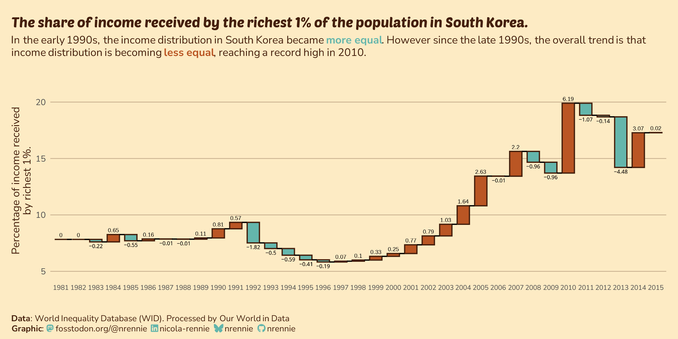
Catching up on Day 16 of the #30DayChartChallenge with the prompt of "Negative"!
Waterfall chart made in #RStats
Doesn't feel as intuitive when decreases are a positive outcome
Needed a few hacky approaches to get the right layout
One thing I enjoy about this social media chart challenge is that I can sneak in silly choices I wouldn't usually make.
Behold my gradient, lack of data point circles, and use of curvy lines!
I also don't have to spend time making it work at a bajillion screen sizes and ratios.
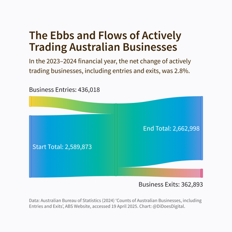
I went on a lot of side quests in pursuit of a more complex and interesting chart than this but they mostly didn't pan out. Here's a simpler but shinier visualisation instead.
According to the ABS, lots of Aussie businesses cease trading in the December quarter each year.
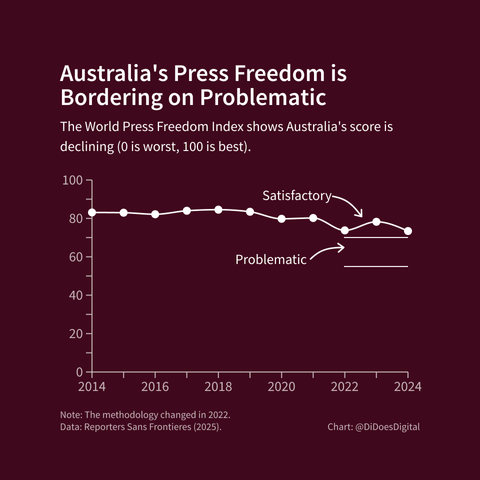
Given the year we've had, I don't have high hopes that Australia's press freedom index ranking will improve next month. Let's make some changes!
I'm a little bit behind on posting my #30DayChartChallenge plots - so here's Day 15 for the prompt of "Complicated"
Inverted the prompt and made an uncomplicated plot!
Trying the new #tidyplots package in #RStats
Appreciate the naturally clean chart aesthetics
Still works nicely with #ggplot2 extensions
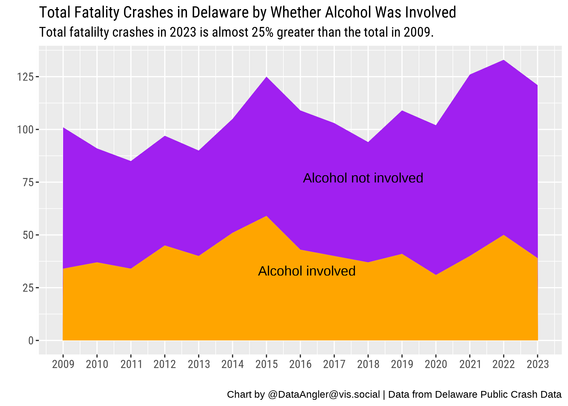
For day 2 of #30DayChartChallenge, I made an area chart in #rstats to show the increase in automobile crashes in Delaware (and the proportion in which alcohol was involved). It might be a stretch to call it a slope chart. :) #dataviz
Code: https://github.com/bardolater/30DayChartChallenge/blob/main/2025/02_Slope.r
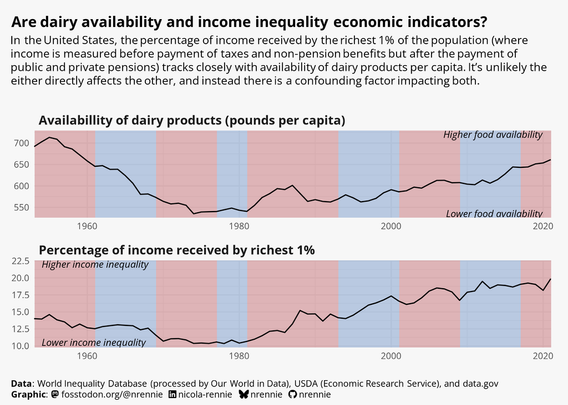
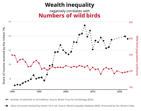
When I decided to visualise the same dataset on income inequality for all 30 prompts of the #30DayChartChallenge, I wasn't sure how I'd manage to make the prompt of "Birds" fit with that data... But I managed to shoehorn some data about birds in there!
The result? A "correlation is not causation" / "dual axes are bad" plot in the style of Spurious Correlations made with #RStats!
The Green Catbird's genus name is Ailuroedus, from the Greek for "cat-singer" or "cat-voiced".
Instead of "Good morning", it says, "heeeir-Ieee-aaa-aarr!"
#30DayChartChallenge Día 16: Negative Relationship FOUND!
¡Lo conseguimos! Tras ajustar por masa corporal, la relación entre Tasa Metabólica Específica (W/kg) y Longevidad Máxima (años) en ~530 especies animales (AnAge DB, outliers quitados) SÍ es negativa (Pearson ρ ≈ -0.42, p < 2.2e-16). #RelationshipsWeek #Animals
El gráfico log-log muestra la tendencia: mayor intensidad metabólica por kilo se asocia con vidas más cortas. ¡Apoya la idea del "ritmo de vida"! Colores por Clase Taxonómica.
Un recordatorio de la importancia de normalizar variables y limpiar datos para ver la señal correcta. ¡Ciencia en acción!
#rstats #ggplot2 #ggpubr | Data: AnAge | Theme: #theme_week3_animals
Código/Viz: https://t.ly/ouLN0

